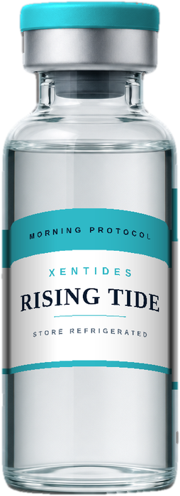
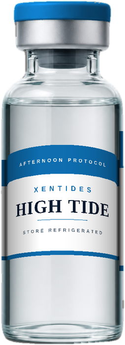
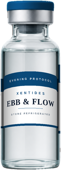
Less noise. More clarity. A considered approach to research materials — clear information, room to focus.
From a legible label to a clear path through the catalog, every element has a purpose. XenTides is built around a simple idea: thoughtful design makes complex information easier to navigate.
Our visual world takes its cues from still water, deep tides, and balanced form — expressions of the brand's aesthetic, not claims about any material.
Discover our approach →
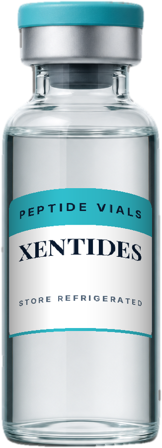
Browse by compound. Compare the available specifications. Find exactly where to go next, without the extra noise.
Explore the catalog →Look for the material specification and matching lot documentation. A clear view of the records helps you ask better questions.
Find documentation →Distinctive packaging. Readable labels. A cohesive identity that brings XenTides into focus from screen to smallest detail.
Meet the packaging →Every batch supported by a lot-specific Certificate of Analysis.
Third-party analytical verification for purity and identity.
Orders placed before 6 PM EST Mon–Fri ship the same day.
Documentation and order queries handled any time.
Deep ocean cartons. Tidal aqua caps. Moonlight silver labels. A concentric ripple mark. An identity that feels consistent from the screen to the smallest label.
Mineral tones, restrained typography, and purposeful spacing — the XenTides palette.
Explore the identity → Images show proposed packaging. Final construction, labeling, and contents are confirmed in the applicable product listing.
Morning / Repair
Peak Performance
Overnight / Recovery